



Understanding ADA Restroom Sign Requirements
ADA restroom signs must meet comprehensive accessibility standards under the Americans with Disabilities Act (ADA), which sets specific requirements for signage in commercial and public buildings. ADA-compliant restroom signs are not just a legal requirement—they are an essential component of creating inclusive, accessible environments for all visitors, including individuals with visual impairments. This guide serves as the comprehensive hub for all ADA signage requirements, covering restroom signs, braille signs, tactile characters, mounting specifications, materials, and compliance best practices for commercial buildings.
ADA restroom sign requirements are defined in the 2010 ADA Standards for Accessible Design, specifically Section 703 (Signs) and related sections. These standards mandate that restroom signs include both visual characters and tactile characters (raised letters) along with Grade 2 Braille, mounted at a specific height and location adjacent to the door. Non-compliance can result in legal liability, fines, and the cost of retrofitting non-compliant signs. For building owners, facility managers, and signage buyers, understanding these requirements is essential to ensuring compliance and avoiding costly mistakes.
This hub page consolidates all ADA signage requirements that were previously covered across multiple articles, including the general ADA signage requirements for commercial buildings. Whether you’re outfitting a new construction project, retrofitting an existing building, or sourcing ADA-compliant signs for a client, this guide provides the complete specifications you need.
ADA Signage Basics: What the Law Requires
The ADA Standards for Accessible Design require that signs identifying permanent rooms and spaces—including restrooms—include tactile characters and Braille. The key requirements are:
- Tactile characters: Raised letters that can be read by touch, with specific height, stroke width, and character proportions.
- Grade 2 Braille: Contracted Braille (the standard form used in the U.S.) positioned directly below the corresponding tactile characters.
- Non-glare finish: Signs must have a non-glare (matte) finish to ensure readability for individuals with low vision.
- Character contrast: Visual characters must contrast with the background (either light on dark or dark on light), with a minimum 70% contrast ratio.
- Mounting height: Tactile signs must be mounted with the baseline of the lowest tactile character between 48 inches (1220 mm) and 60 inches (1525 mm) above the finished floor.
- Mounting location: Signs must be mounted on the latch side of the door, adjacent to the door, with specific clearances from door handles and hardware.
It’s important to note that ADA requirements apply to signs identifying permanent rooms and spaces. Temporary signs, advertising and marketing signs, and building addresses are subject to different (or no) tactile/Braille requirements. However, restroom signs are explicitly classified as permanent room identification signs and must comply fully with tactile and Braille requirements.
Tactile Character Specifications
Tactile characters are raised letters that allow individuals with visual impairments to read the sign by touch. The ADA specifies detailed requirements for tactile characters:
Character Height
Tactile characters must be between 5/8 inch (16 mm) and 2 inches (51 mm) in height, measured as the height of an uppercase “I.” For most restroom signs, a character height of 3/4 inch to 1 inch is standard and provides the best balance of readability and sign size.
Stroke Width
The stroke width of tactile characters must be between 10% and 30% of the character height. For example, for a 1-inch tall character, the stroke width must be between 0.1 inches and 0.3 inches. This ensures that the raised strokes are thick enough to be easily felt but not so thick that they become difficult to distinguish.
Character Proportions
Tactile characters must have a width-to-height ratio between 3:5 and 1:1. This means the characters should be relatively condensed (not extended or wide). Sans-serif fonts such as Helvetica, Arial, Futura, or Avenir are recommended, as their uniform stroke widths and simple letterforms are easier to read tactilely than serif or decorative fonts.
Raised Height
Tactile characters must be raised a minimum of 1/32 inch (0.8 mm) above the sign background. This minimum height ensures that the characters can be easily distinguished by touch. Most ADA sign manufacturers produce tactile characters with a raised height of 1/32 to 1/16 inch (0.8–1.6 mm), which provides good tactile definition while maintaining durability.
Character Case
Tactile characters must be uppercase only. Mixed case or lowercase tactile characters are not permitted, as uppercase letters are more uniform and easier to distinguish by touch. Visual characters (the printed or raised characters intended for visual reading) may be uppercase or title case, but the tactile characters must be uppercase.
Grade 2 Braille Requirements
Braille is a system of raised dots that allows individuals with visual impairments to read through touch. ADA-compliant restroom signs must use Grade 2 Braille, also known as contracted Braille, which is the standard form used in the United States for general reading.
Grade 1 vs Grade 2 Braille
Grade 1 Braille (uncontracted Braille) spells out every word letter by letter, with no contractions. Grade 2 Braille (contracted Braille) uses approximately 189 contractions and short-form words to reduce the space required and increase reading speed. ADA requires Grade 2 Braille because it is the standard form taught in U.S. schools and used in public signage. Using Grade 1 Braille on public signage is non-compliant.
Braille Dot Specifications
- Dot height: Braille dots must be raised a minimum of 1/32 inch (0.8 mm) above the sign background, consistent with tactile character height.
- Dot diameter: Braille dots must have a diameter between 1/32 inch (0.8 mm) and 3/64 inch (1.2 mm) at the base.
- Dot spacing: Dots within a Braille cell must be spaced 2/38 inch (1.34 mm) apart horizontally and vertically (center-to-center).
- Cell spacing: Adjacent Braille cells must be spaced 2/15 inch (3.38 mm) apart (center-to-center) horizontally.
- Line spacing: Braille lines must be spaced a minimum of 1/4 inch (6.4 mm) apart (baseline-to-baseline).
Braille Placement Relative to Tactile Characters
Braille must be positioned directly below the corresponding tactile characters, with the baseline of the Braille dots a minimum of 3/8 inch (9.5 mm) below the baseline of the tactile characters. If the tactile characters are arranged in multiple lines, the Braille for each line must be placed directly below that line. Braille must be separated from any other tactile or visual elements by a minimum of 3/8 inch (9.5 mm) to prevent confusion during tactile reading.
Braille for Restroom Signs
Standard restroom signs typically include the words “MEN,” “WOMEN,” “RESTROOM,” “UNISEX,” “ACCESSIBLE,” or similar text. Each word must be translated into Grade 2 Braille using the appropriate contractions. For example, “MEN” uses the contraction for “M” + “EN,” and “WOMEN” uses the contraction for “W” + “O” + “MEN.” A reputable ADA sign manufacturer will use certified Braille translation software and have Braille accuracy verified by a qualified inspector.
Mounting Height and Location Specifications

Proper mounting is as important as the sign itself for ADA compliance. A perfectly manufactured restroom sign mounted at the wrong height or location is non-compliant.
Mounting Height
Tactile signs must be mounted with the baseline of the lowest tactile character (not the bottom of the sign or the Braille) between 48 inches (1220 mm) and 60 inches (1525 mm) above the finished floor. This range ensures that the sign is within comfortable reach for individuals using wheelchairs and for standing individuals. The most common mounting height is 54 inches (1370 mm) to the baseline of the lowest tactile character, which falls in the middle of the required range and accommodates most users.
Mounting Location (Latch Side)
Tactile restroom signs must be mounted on the latch side of the door (the side with the door handle or latch), adjacent to the door. This ensures that individuals approaching the door can locate and read the sign before reaching for the handle. The sign must be mounted on the wall adjacent to the door, not on the door itself (door-mounted signs are not permitted for tactile signs, as the door may be open or moving when an individual attempts to read the sign).
Clearance from Door Hardware
The sign must be positioned so that it does not interfere with door operation. Specifically, the sign must be located outside the door’s swing arc and must not be mounted within the area of door hardware operation. For doors that swing toward the sign side, additional clearance may be required. A common guideline is to mount the sign with its nearest edge at least 3 inches (75 mm) from the door frame and at least 6 inches (150 mm) from any door handle or hardware.
Double Doors and Alternate Mounting Locations
For restrooms with double doors, the sign should be mounted on the latch side of the active leaf (the door that is typically used for entry). If there is no wall space on the latch side of the door (e.g., the door opens directly into a wall or another door), the sign may be mounted on the nearest adjacent wall, as long as it is within the required height range and is clearly associated with the restroom entrance. In all cases, the sign must be positioned so that it is the first tactile sign an individual encounters when approaching the restroom entrance.
Contrast and Finish Requirements
Character Contrast
Visual characters on ADA signs must have a minimum contrast ratio of 70% with the sign background. This can be achieved with either light characters on a dark background (e.g., white letters on a dark blue sign) or dark characters on a light background (e.g., black letters on a white sign). The 70% contrast requirement is measured as the difference in light reflectance value (LRV) between the characters and the background. High contrast is essential for individuals with low vision and color vision deficiencies.
Non-Glare Finish
Both the sign background and the characters must have a non-glare (matte or eggshell) finish. Glossy or reflective finishes create glare that can make signs difficult or impossible to read for individuals with low vision, particularly under fluorescent or overhead lighting. Matte finishes diffuse light and ensure consistent readability from all angles. When specifying ADA signs, explicitly require a matte or non-glare finish for both the substrate and the tactile characters.
Color Considerations
While the ADA does not mandate specific colors for restroom signs, certain color combinations have become standard in the industry and provide excellent contrast:
- Dark blue background with white characters: The most common and widely accepted combination for ADA restroom signs.
- Black background with white characters: High contrast, modern appearance.
- White background with black characters: Clean, minimal appearance, suitable for contemporary interiors.
- Dark brown/bronze background with white characters: Warm, traditional appearance, suitable for hotels and upscale environments.
When selecting colors, avoid low-contrast combinations such as gray on white, yellow on white, or pastel colors on white, as these may not meet the 70% contrast requirement. Always verify contrast using a light reflectance value (LRV) meter or contrast calculator.
Approved Materials for ADA Restroom Signs

ADA restroom signs can be manufactured from a variety of materials, as long as the material meets the contrast, non-glare, and durability requirements. The most common materials include:
Acrylic (Plexiglass / Lucite)
Acrylic is the most popular material for ADA restroom signs due to its versatility, durability, and cost-effectiveness. Acrylic signs can be manufactured using several methods:
- Laser-engraved acrylic: A two-layer acrylic sheet (e.g., dark blue top layer with white core) is laser-engraved to remove the top layer and expose the core color, creating the characters and Braille dots. This method produces durable, high-contrast signs with consistent tactile definition.
- Routed acrylic with photopolymer Braille: The sign background is routed from acrylic, and tactile characters and Braille are applied using photopolymer (a light-sensitive material that cures into raised shapes). This method allows for more design flexibility and is suitable for complex signs.
- Acrylic with appliqué characters: Pre-fabricated tactile characters and Braille dots are adhered to an acrylic background. This method is less common and may have durability concerns if the adhesive fails.
Acrylic signs are available in a wide range of colors, are lightweight, and have excellent resistance to moisture and cleaning chemicals. They are suitable for both indoor and protected outdoor applications. For a detailed comparison of acrylic with other sign materials, see our sign materials comparison guide.
Photopolymer
Photopolymer is a specialized material used exclusively for ADA tactile and Braille signs. It is a liquid polymer that is exposed to UV light through a film negative, causing the exposed areas to cure and rise into raised characters and Braille dots. The unexposed material is then washed away, leaving a durable, high-quality tactile sign. Photopolymer signs offer the highest tactile definition and Braille accuracy, and they are available in a wide range of colors and finishes. They are more expensive than laser-engraved acrylic but are considered the gold standard for ADA compliance and durability.
Metal (Aluminum, Stainless Steel, Bronze)
Metal ADA signs are manufactured by etching or routing the characters and Braille dots into a metal substrate, then filling the recessed areas with a contrasting color (for visual characters) or leaving them raised (for tactile characters). Metal signs offer a premium, durable appearance and are suitable for high-end commercial buildings, hotels, and institutional environments. However, metal signs can be heavier and more expensive than acrylic or photopolymer, and the tactile definition may not be as precise. Stainless steel and bronze signs are particularly popular for upscale interiors and exterior applications. Our guide to metal letters and signs provides additional information on metal sign materials and finishes.
Other Materials
- Phenolic (micarta): A durable, layered plastic material used for ADA signs, particularly in institutional and industrial environments. Phenolic signs are resistant to chemicals, heat, and impact.
- Wood: Wood ADA signs are available but less common due to concerns about durability, moisture resistance, and the difficulty of achieving precise tactile definition. Wood signs are typically used in specialty or rustic environments and must be sealed with a matte, non-glare finish.
- Glass: Glass ADA signs are rare due to the difficulty of creating durable tactile characters and Braille on glass. When used, glass signs typically have applied tactile characters and require special mounting considerations.
Common ADA Restroom Sign Types and Applications
Men’s and Women’s Restroom Signs
Standard gender-specific restroom signs include the words “MEN” or “WOMEN” in tactile characters and Grade 2 Braille, often accompanied by a pictogram (gender symbol). Note that while pictograms are commonly included on restroom signs, the ADA does not require pictograms on tactile signs—they are optional visual elements. If a pictogram is included, it must be placed outside the tactile field (at least 3/8 inch from tactile characters and Braille) and must have its own clear field. The tactile characters and Braille must be in a separate clear field below or beside the pictogram.
Unisex / All-Gender Restroom Signs
Unisex or all-gender restrooms are becoming increasingly common in commercial buildings, educational institutions, and public spaces. ADA-compliant unisex restroom signs typically include the words “UNISEX,” “ALL GENDER,” “RESTROOM,” or “ALL USER” in tactile characters and Grade 2 Braille. The sign may also include a pictogram representing a unisex or all-gender symbol (e.g., a combined male/female symbol or a gender-neutral figure). As with all ADA signs, the tactile characters and Braille must be in a clear field, mounted at the correct height and location.
Accessible Restroom Signs
Restrooms designated as accessible (handicap-accessible) may include the International Symbol of Accessibility (wheelchair symbol) in addition to the standard restroom text. Note that the wheelchair symbol is a pictogram and does not need to be tactile—it is a visual element only. The tactile characters and Braille must still include the restroom identification text (e.g., “MEN,” “WOMEN,” “UNISEX,” or “RESTROOM”). The wheelchair symbol should be placed in a separate clear field from the tactile characters and Braille.
Family Restroom / Assisted Changing Signs
Family restrooms or assisted changing rooms may include text such as “FAMILY RESTROOM,” “ASSISTED CHANGING,” or “UNIVERSAL CHANGING ROOM” in tactile characters and Grade 2 Braille. These signs may also include pictograms representing a family or changing table. As with all ADA signs, the tactile field must be clearly separated from any pictograms, and the sign must be mounted at the correct height and location.
Restroom Directional Signs
Directional signs pointing toward restrooms (e.g., “RESTROOM →” or “MEN’S ROOM ←”) are not required to have tactile characters or Braille, as they are not permanent room identification signs—they are directional/wayfinding signs. However, if a directional sign includes tactile characters, it must comply with all tactile character and Braille requirements. Most restroom directional signs are visual-only signs and do not require tactile or Braille elements.
ADA Compliance Checklist for Restroom Signs
Use this checklist to verify that your restroom signs are fully ADA-compliant:
- ☐ Tactile characters are uppercase only
- ☐ Tactile character height is between 5/8″ and 2″
- ☐ Tactile character stroke width is between 10% and 30% of character height
- ☐ Tactile character width-to-height ratio is between 3:5 and 1:1
- ☐ Tactile characters are raised a minimum of 1/32″ above the background
- ☐ Sans-serif font is used (no serif or decorative fonts for tactile characters)
- ☐ Grade 2 (contracted) Braille is used (not Grade 1)
- ☐ Braille dots meet diameter, height, and spacing specifications
- ☐ Braille is positioned directly below the corresponding tactile characters
- ☐ Braille baseline is a minimum of 3/8″ below the tactile character baseline
- ☐ Sign has a non-glare (matte) finish on both background and characters
- ☐ Character-to-background contrast ratio is at least 70%
- ☐ Sign is mounted on the latch side of the door, adjacent to the door
- ☐ Baseline of lowest tactile character is between 48″ and 60″ above finished floor
- ☐ Sign is not mounted on the door itself
- ☐ Sign is outside the door swing arc and clear of door hardware
- ☐ Pictograms (if included) are in a separate clear field from tactile characters/Braille
- ☐ Sign is durable and suitable for the installation environment (indoor/outdoor)
- ☐ Braille translation has been verified for accuracy by a qualified inspector
Common ADA Sign Mistakes to Avoid
Mistake 1: Using Grade 1 Braille Instead of Grade 2
Problem: Some sign manufacturers use Grade 1 (uncontracted) Braille because it is simpler to produce, but Grade 1 is not compliant with ADA requirements for public signage.
Solution: Always specify Grade 2 (contracted) Braille and verify that the manufacturer uses certified Braille translation software. Request Braille verification documentation or a certificate of compliance with your order.
Mistake 2: Mounting at the Wrong Height
Problem: Signs are often mounted too high (e.g., 66 inches or eye level for standing individuals) or too low, violating the 48–60 inch baseline requirement.
Solution: Always measure to the baseline of the lowest tactile character, not the bottom of the sign or the center of the sign. Mount at 54 inches to the baseline for optimal compliance. Provide clear mounting instructions to the installer, including the measurement reference point.
Mistake 3: Mounting on the Door Instead of the Wall
Problem: Some facilities mount restroom signs on the door itself for convenience, but door-mounted tactile signs are not ADA-compliant because the door may be open or moving when an individual attempts to read the sign.
Solution: Always mount tactile restroom signs on the wall adjacent to the door, on the latch side. If wall space is limited, use a projecting sign or an alternate mounting location that complies with the height and location requirements.
Mistake 4: Glossy or Reflective Finish
Problem: Signs with glossy or high-gloss finishes create glare under overhead lighting, making them difficult or impossible to read for individuals with low vision.
Solution: Always specify a matte or non-glare finish for both the sign background and the tactile characters. Avoid polished metal or glossy acrylic for ADA signs. If a metal sign is desired, use a brushed or satin finish (not polished).
Mistake 5: Insufficient Contrast
Problem: Low-contrast color combinations (e.g., gray on white, light blue on white, or similar tones) fail to meet the 70% contrast requirement and are difficult to read for individuals with low vision or color blindness.
Solution: Use high-contrast color combinations such as white on dark blue, white on black, or black on white. Verify contrast using a light reflectance value (LRV) meter or contrast calculator. When in doubt, choose a higher-contrast combination.
Mistake 6: Incorrect Braille Placement
Problem: Braille is sometimes placed beside the tactile characters instead of below them, or is too close to the characters, making it difficult for tactile readers to distinguish between the letters and the Braille.
Solution: Always place Braille directly below the corresponding tactile characters, with a minimum of 3/8 inch clearance between the character baseline and the Braille baseline. Ensure Braille is in its own clear field, separated from all other visual and tactile elements by at least 3/8 inch.
Mistake 7: Using Serif or Decorative Fonts
Problem: Signs using serif fonts (e.g., Times New Roman) or decorative fonts (e.g., script, stylized) have uneven stroke widths and complex letterforms that are difficult to read tactilely and may not meet the character proportion requirements.
Solution: Always use sans-serif fonts with uniform stroke widths for tactile characters, such as Helvetica, Arial, Futura, Avenir, or similar fonts. Verify that the font meets the width-to-height ratio and stroke width requirements.
ADA Signage for Other Building Elements (Beyond Restrooms)
While this hub focuses on restroom signs, it’s important to understand that ADA tactile signage requirements apply to all permanent room and space identification signs in commercial buildings, including:
- Room identification signs: Offices, conference rooms, storage rooms, mechanical rooms, and other permanent rooms.
- Egress and exit signs: Exit signs, stair identification signs, floor number signs, and “you are here” directory signs. Note that illuminated exit signs have additional requirements under NFPA 101 and UL 924, covered in our exit signs and emergency signage guide.
- Accessible feature signs: Signs identifying accessible entrances, accessible elevators, accessible restrooms, and other accessible features must include the International Symbol of Accessibility.
- Directional and informational signs: While directional signs do not require tactile characters or Braille, they must meet visual character requirements (height, contrast, non-glare finish) for readability by individuals with low vision.
- Parking signs: Accessible parking signs must include the International Symbol of Accessibility and meet specific size and mounting requirements.
For a comprehensive overview of all ADA signage requirements for commercial buildings, including egress, accessible features, and directional signage, consult the 2010 ADA Standards for Accessible Design, Section 703 (Signs), or work with a qualified ADA signage consultant. For outdoor sign installations, also consider local zoning and permit requirements, covered in our outdoor sign permits and zoning guide.
How to Source ADA-Compliant Restroom Signs
When sourcing ADA-compliant restroom signs, follow these best practices to ensure you receive compliant, high-quality products:
- Specify compliance explicitly: In your purchase order or request for quotation, explicitly state that the signs must comply with the 2010 ADA Standards for Accessible Design, Section 703, including tactile characters, Grade 2 Braille, mounting height, contrast, and non-glare finish requirements.
- Request compliance documentation: Ask the manufacturer to provide a certificate of compliance or a letter confirming that the signs meet all ADA requirements. Some manufacturers also provide Braille verification reports.
- Request a sample: Before placing a bulk order, request a physical sample of the sign to verify tactile definition, Braille accuracy, color contrast, finish, and overall quality. Our guide to sign sampling provides information on the sampling process.
- Verify Braille accuracy: If possible, have the Braille on the sample verified by a qualified Braille inspector or accessibility consultant. Braille errors (incorrect contractions, misspelled words, wrong dot placement) are common among low-quality manufacturers and can render a sign non-compliant.
- Provide mounting instructions: Include clear mounting instructions with your order, specifying the required mounting height (48–60 inches to the baseline of the lowest tactile character) and location (latch side of the door, adjacent to the door). Provide these instructions to your installer as well.
- Choose a reputable manufacturer: Work with a manufacturer that specializes in ADA-compliant signage and has a proven track record of compliance. Avoid low-cost suppliers that may cut corners on tactile definition, Braille accuracy, or material quality. Our guide to choosing a reliable sign manufacturer provides criteria for supplier evaluation.
Hongbo Sign ADA-Compliant Restroom Signs
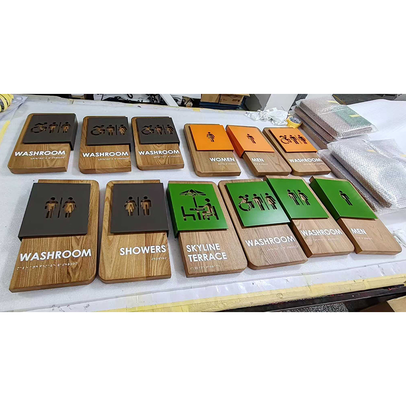
At Hongbo Sign, we manufacture fully ADA-compliant restroom signs and Braille signs for commercial buildings, hotels, offices, healthcare facilities, educational institutions, and public spaces. Our ADA signs are manufactured to meet or exceed all requirements of the 2010 ADA Standards for Accessible Design, Section 703:
- Premium materials: We offer laser-engraved acrylic, photopolymer, and metal ADA signs in a wide range of standard and custom colors. All signs feature a matte, non-glare finish and high-contrast color combinations.
- Precision tactile characters: Our tactile characters are manufactured to exact specifications—uppercase sans-serif font, 5/8″ to 2″ height, 10–30% stroke width ratio, 3:5 to 1:1 width-to-height ratio, and minimum 1/32″ raised height.
- Certified Grade 2 Braille: All Braille is translated using certified Grade 2 Braille software and verified for accuracy by our quality control team. Braille dots meet all diameter, height, and spacing specifications, and are positioned directly below the corresponding tactile characters with proper clearance.
- Custom options: We offer custom sizes, colors, materials, and layouts to match your building’s interior design. We can include pictograms, room numbers, building identifiers, and other custom elements while maintaining full ADA compliance.
- Compliance documentation: Every ADA sign order includes a certificate of compliance confirming that the signs meet all 2010 ADA Standards requirements. We also provide mounting instructions specifying the required height and location.
- Bulk order capability: Whether you need signs for a single restroom or a full building rollout (50+ rooms), we can accommodate orders of any size with consistent quality and competitive pricing.
- International shipping: We ship ADA-compliant signs worldwide, with careful packaging to protect tactile characters and Braille during transit. Our shipping terms guide provides information on international shipping options.
We understand that ADA compliance is not optional—it’s a legal requirement and an essential part of creating accessible environments. That’s why we take ADA compliance seriously at every stage of production, from design and material selection to manufacturing, quality control, and packaging. Our team is knowledgeable about the latest ADA Standards and can advise you on sign type, placement, mounting, and compliance for your specific project.
If you need illuminated or backlit ADA restroom signs, all LED components must meet relevant safety and performance certifications. We can advise on compliant lighting options for your project.
Ready to source fully ADA-compliant restroom signs for your project? Contact us today for a free consultation and factory-direct quote. Our team will help you select the right materials, colors, and configurations for your building, and ensure every sign meets all ADA requirements.
Frequently Asked Questions
Q: What is the required mounting height for ADA restroom signs?
A: Tactile restroom signs must be mounted with the baseline of the lowest tactile character between 48 inches (1220 mm) and 60 inches (1525 mm) above the finished floor. The most common mounting height is 54 inches (1370 mm) to the baseline. Signs must be mounted on the latch side of the door, not on the door itself.
Q: Do all restroom signs need Braille?
A: In the United States, ADA Standards require permanent room identification signs—including restroom signs—to include tactile characters and Grade 2 Braille. Temporary signs, changeable signs, and building directories may have different requirements. Always verify the applicable accessibility standards for your jurisdiction and project type.
Q: What materials are best for ADA-compliant restroom signs?
A: Common materials include acrylic, aluminum, and phenolic resin. The choice depends on durability requirements, aesthetic preferences, and budget. Acrylic is popular for its color options and clean appearance, while aluminum and phenolic offer enhanced durability for high-traffic or outdoor-adjacent areas. The tactile characters and Braille must meet specific contrast and finish requirements regardless of material.