


A pharmacy is a strange kind of retail. It sells shampoo and baby formula next to a prescription counter where privacy, accuracy, and trust matter more than any sale. That duality shows up in signage: the storefront needs to look inviting and trustworthy, the prescription counter needs to feel private and professional, and the interior needs to guide anxious customers — a parent with a sick child, an elderly patient looking for a vaccine clinic — without overwhelming them.
Pharmacy signage also sits at the intersection of retail and healthcare. It borrows materials and design discipline from both worlds: the clean, easy-to-wipe surfaces of a clinic, and the illuminated, brand-driven storefront of a retail chain. It carries conventions — the Rx symbol, accessibility markers, department names — that customers expect to see in predictable places. And it is governed by local retail, egress, and sometimes health-care signage requirements that a sign designer cannot invent on their own.
This guide is written for pharmacy owners, chain retail operations teams, hospital outpatient clinic designers, and procurement managers who are ordering a custom sign program from an OEM/ODM manufacturer. We cover storefront identification, interior department wayfinding, accessibility awareness, materials that survive a sanitizing environment, and the practical production questions: MOQ, lead time, packaging, and export shipping. We are not your legal advisor; local code and pharmacy board rules always take precedence over anything written here.
Storefront Identification: The Pharmacy Signage Customers See First
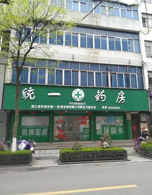
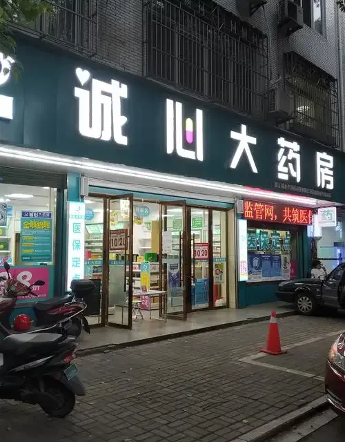
The pharmacy storefront has one job in the first three seconds: tell people you are there, what you sell, and whether you are open. For a stand-alone drugstore, that usually means a primary illuminated sign with the brand name, a secondary sign marking the pharmacy or prescription entrance, and sometimes a window decal showing hours or services (drive-thru, immunizations, COVID testing).
Illuminated pharmacy wayfinding signs are a strong choice here because they read well after dark, when customers on their way home from work are deciding where to drop off a prescription. A backlit or edge-lit storefront gives a calmer, more clinical feel than high-saturation neon, which tends to read “nightclub” rather than “healthcare.”
For pharmacies inside a mall or a multi-tenant medical plaza, the storefront is constrained by landlord signage rules. The brand may be limited to a specific sign band, height, and illumination type. In those cases, working with a manufacturer who has experience producing to exact facade constraints — recessed depth, specific mounting rails, landlord-approved finishes — saves expensive revisions. If you are coordinating a pharmacy as one tenant among many, our guide on multi-tenant property signage coordination covers how landlords and tenants usually split design and installation.
The Rx Symbol and Prescription Counter Identification
The Rx symbol is one of the most recognized marks in retail healthcare. Customers look for it to find the prescription drop-off, pickup counter, and consultation window. Because it is so widely recognized, its placement and design matter more than most other signage in the store.
Practical conventions (always verify against local pharmacy board rules and your brand style guide):
- A dedicated “Pharmacy” or “Prescriptions” sign above the drop-off/pickup area, often paired with the Rx symbol.
- A separate sign marking the consultation window, where privacy conversations take place.
- Directional signs from the front door to the pharmacy counter, especially in stores where the pharmacy is at the back.
- “Pickup” and “Drop-off” delineation on the counter itself.
- Signs for drive-thru lanes where applicable, readable from a vehicle.
The prescription area should feel quieter than the rest of the store. Lower-saturation colors, calmer lighting, and a clear visual separation from the OTC aisle all reinforce that this is a different kind of space.
Interior Department and Wayfinding Signs
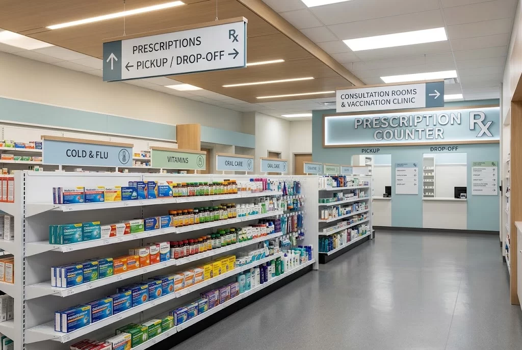
Inside a modern pharmacy, the sign program usually covers:
- Front-of-store categories: Beauty and cosmetics, skincare, oral care, baby, and seasonal.
- OTC categories: Cold and flu, pain relief, allergy, digestive health, vitamins.
- Clinical services: Immunizations, blood pressure station, diabetes care, compression socks.
- Patient services: Pickup, drop-off, consultation, privacy booth, restrooms.
- Back-of-house and compliance: Exit signs, restroom identification, pharmacy restricted area notices.
Interior directional and department signs for these areas need to be readable at walking speed and consistent in style. LED room and department nameplates work well for smaller identifiers — treatment rooms, consultation booths, the immunization station — because they are slim, professional, and easy to match to the storefront brand.
Wayfinding in a pharmacy is slightly different from a grocery store. Customers are often in a hurry or in discomfort. Signs should be unambiguous: a single arrow, a large category name, no cute copy. A customer looking for allergy medicine at 2 a.m. does not want a poetic pun.
Accessibility and Dignity in Sign Design
Pharmacies serve a broad population, including elderly customers, customers with low vision, and customers with mobility impairments. Signage should reflect that:
- Larger type than a typical boutique, with high contrast between text and background.
- Consistent mounting height so customers do not have to look in different places for the same kind of sign.
- Icons paired with words where appropriate, so that customers with limited English or low literacy can still find the pickup counter.
- Braille and tactile elements for interior identification where local accessibility rules require them — this is a design specification your manufacturer can support but should be confirmed against local code.
- Clear restroom and elevator identification in larger stores.
We deliberately use the phrase “accessibility awareness” rather than making legal claims, because accessibility requirements vary by country, state, and building code. Your local architect or code consultant is the right source for what your specific building must include.
Materials That Survive a Healthcare-Retail Environment
Pharmacy interiors are cleaned more aggressively than most retail spaces. Surfaces are wiped with disinfectant multiple times a day, and spills — syrup, alcohol, hand sanitizer — are common. The right materials hold up to this:
- Acrylic and polycarbonate for illuminated faces and interior panels. They are non-porous, easy to wipe, and do not delaminate the way laminated paper signs do.
- Aluminum composite for flat department signs and directory panels. Rigid, printable, and unaffected by most disinfectants.
- Stainless steel for the prescription counter frontage and consultation window frames, where a premium, clinical feel matters.
- Powder-coated metal for exterior signs, chosen because it does not chalk or fade under UV the way painted finishes do.
Hongbo Signage’s production process for these materials typically uses laser cutting for precision acrylic and metal shapes, bending and welding for counterfront and exterior structures, and powder coating for consistent exterior finishes. Every illuminated sign goes through an aging test before packing so that a dim LED module is caught at the factory rather than above the customer pickup window.
Egress and Compliance Signs
Beyond the brand and wayfinding layer, a pharmacy storefront and interior must carry the standard compliance signs expected of any retail space: illuminated exit signs, directional arrows to the nearest exit, and restroom identification. For guidance on how exit and egress signage is typically designed, our guide on pharmacy egress and exit signage walks through the common conventions.
Because pharmacies often store controlled medications and prescription drugs, there may also be restricted-area signs for the pharmacy back room, the vault, and the immunization refrigerator. These are usually simple, professional signs in the same material system as the rest of the interior program, not heavy industrial warning placards.
MOQ, Lead Time, and Export Shipping
For a single independent pharmacy, a full sign package typically runs from a few signs (small storefront and pickup counter) to a few dozen (storefront plus interior department program). MOQ is low enough to support an independent opening. For a regional or national pharmacy chain, the same sign program is repeated across dozens of locations, and standardization becomes the priority: same artwork, same Pantone, same LED color temperature, same mounting hardware.
Lead time for custom pharmacy signage is typically 10-25 working days after artwork approval, depending on quantity, illumination, and material complexity. For multi-location rollouts, wave planning is the safest approach: pilot store, install, photograph, refine, then roll out the corrected spec to the remaining locations.
Shipping most often goes by sea. LCL works for a single storefront shipment; FCL makes sense for a regional rollout. Signs are packed in foam, corner-protected, and strapped to pallets, with each carton labeled by destination store. Air freight is reserved for urgent replacements. On arrival, a quick QC pass — count cartons, verify serial numbers, inspect a sample face — catches most issues before installation. For a line-item breakdown of what drives sign cost, our guide on pharmacy sign cost factors walks through the main variables.
What Buyers Should Prepare for a Sign Quote
Before requesting a pharmacy sign quote, gather the inputs that keep the quotation both brand-accurate and compliance-aware:
- Awareness of your local pharmacy board and retail signage rules, plus your brand style guide for the Rx symbol and wordmark.
- A floor plan showing the prescription drop-off, pickup, consultation window, OTC aisles, and clinical service zones.
- Interior zoning notes: where the pharmacy counter sits relative to the front door, and the drive-thru lane if you have one.
- Accessibility considerations: your expected viewer population (elderly, low vision), and any Braille or tactile elements your architect flags.
- Material needs for a sanitizing environment: non-porous, disinfectant-safe surfaces for high-touch areas.
- A list of compliance signs expected (exit, restricted back-room, vault, immunization refrigerator) so they match the interior system.
- Your rollout schedule if you are a regional or national chain, with pilot-store feedback built in.
Frequently Asked Questions
Q: Do pharmacies need special signs for the Rx symbol?
The Rx symbol is a widely recognized convention for prescription services, but its exact use and placement are usually governed by your local pharmacy board and brand style guide. We recommend including a clearly marked “Pharmacy” or “Prescriptions” sign at the drop-off/pickup area and confirming final wording with your pharmacist or compliance advisor.
Q: What materials work best in a pharmacy interior?
Acrylic, polycarbonate, aluminum composite, and stainless steel all work well because they are non-porous and easy to wipe with disinfectant. Avoid laminated paper signs in high-touch areas; they delaminate quickly in a sanitizing environment.
Q: Can one manufacturer produce signs for an entire pharmacy chain?
Yes. The most reliable multi-location pharmacy rollouts use a single OEM/ODM manufacturer so that artwork, Pantone values, LED temperature, and mounting hardware stay identical. This avoids drift between locations and simplifies reorders.
Q: What is the typical lead time for pharmacy signage?
Typical lead time is 10-25 working days after artwork approval, depending on quantity, illumination, and material complexity. Add transit time: sea freight typically takes several weeks door-to-door, while air freight is faster but more expensive.
Q: Do pharmacy signs need to follow accessibility rules?
Pharmacies serve a broad population, including elderly customers and customers with low vision, so larger type, high contrast, and clear icons are good design practice. Whether Braille, tactile elements, or specific accessibility features are legally required depends on your local building code — confirm with your architect or code consultant.
Conclusion
Pharmacy signage balances retail warmth with clinical trust. The storefront invites customers in after dark; the prescription counter signals privacy and professionalism; interior department signs guide anxious customers to what they need; and compliance signs cover the egress and restricted-area baseline. Choosing non-porous, easy-clean materials (acrylic, aluminum composite, stainless steel), designing to consistent mounting and type standards, and partnering with a single OEM/ODM manufacturer keeps a single pharmacy coherent and a national chain consistent. For an independent drugstore or a regional pharmacy brand, the sign program is worth planning as a system — not as a stack of individual signs.
Specifying pharmacy signage that meets both brand and compliance needs?
Hongbo Signage provides OEM/ODM custom signage manufacturing from Guangzhou, China. Get a custom sign quote within 24 hours.